Doodles > Acorn Archimedes logo
Second attempt - 2024

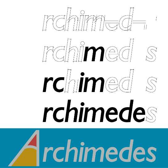
My first attempt at drawing this logo (see below) used a respaced and slightly modified Gill Sans as the main text. In restrospect it looked a bit too light. Also the “i” and the “m” were a bit too close together in the result. In this version I’ve redrawn the whole logo from scratch.

Downloads
License
This graphic, Archimedes Computer Logo Recreation 2 by David Piero Thomas, is licensed under Attribution-ShareAlike 4.0 International .
You are free to share and adapt it, even commercially, but you must give appropriate credit and indicate if changes were made, and you must distribute your contributions under the same license.
First attempt - 2019
I have recreated the logo from Acorn’s Archimedes range of computers:

I traced this from a scan of the original and matched the fonts. The original seems to have marginally thicker letterforms (although that perhaps could be an artefact of the printing process) and a slightly different slope on the end of the ‘r’. It’s a pretty good match otherwise.
Why do this? To make custom mouse mats of course!

Downloads
License
This graphic, Archimedes Computer Logo Recreation by David Piero Thomas, is licensed under Attribution-ShareAlike 4.0 International .
You are free to share and adapt it, even commercially, but you must give appropriate credit and indicate if changes were made, and you must distribute your contributions under the same license.